Colour contrast
When publishing content that will be viewed on a screen, colour contrast is really important. It affects some people's ability to read or access the information presented.
Everyone who can see, sees things in different ways. The eye and the brain work together to distinguish shapes, patterns and colours, but for many people this can be quite difficult.
Sometimes the term colour blindness is used, but this could be misleading. Colour Vision Deficiency (CVD) better describes a difference in this area.
The RNIB has some information about CVD on their website: Colour Vision Deficiency (CVD), also known as colour blindness .
How colour contrast affects digital content
There are two things that need to be considered:
1. Using colour to indicate something
Anything that uses colour to indicate something, such as a RAG (Red, Amber, Green) rating, needs to have a secondary way for that information to be given, and a description of what the colour coding means. If text is placed over a colour, the text colour must be chosen carefully to provide good colour contrast.
Here is an example of RAG rating colours with text over them:
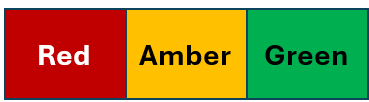
Red means there are problems that require attention. Amber means there are potential issues or delays. Green means that things are on track.
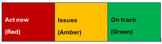
However, even if you provide text to explain the colour this would still cause access issues for people using assistive software. It is more helpful to include what the red, amber and green symbolise as shown below.
2. Placing text or another element over colour
Text or any other element on screen has to be distinguishable from the background.
In this example, the word "Colour" has good contrast with the background and is easy to perceive, whereas the word "Contrast" has poor contrast and is harder to perceive.

- If you use a dark background, remember to use light text
- If you use a light background, remember to use dark text
Colour contrast and assistive technology
Colour contrast is important to visually impaired people, and people with learning difficulties, who use assistive technology to access information. This software can change the background colour of the information or the colour of the text, so they can read it more easily.
Their assistive technology can do this if you use the right colour contrast. If you do not, you will make the information inaccessible to them.
Example a. The words 'Colour contrast' written in black text over a white background
This shows accessible dark text against a light background being viewed using assistive software. Notice the text shows through.
Example b. The words 'Colour contrast' written in pink text over a white background
This shows the inaccessible pink text against a light background being viewed using assistive software. The text is not visible at all.
Colour contrast affects everybody
This issue does not only affect those who may have some level of CVD or uses assistive technology. It affects everyone who uses screens:
- The amount of light that reaches the back of the eye can reduce as we age
- Screens used vary significantly in size, resolution and contrast
- Environmental lighting significantly effects how content appears on a screen
For web content, the Web Content Accessibility Guidelines (WCAG) recommend minimum levels of colour contrast between text and background, based on a mathematical formula. These guidelines should be used when creating any form of content to be viewed on a screen, such as a Word document or PowerPoint presentation.
How to check for good colour contrast
There are many tools available to help you to check the colour contrast on a webpage or document.
If you are using colour to indicate information
Change an image, graph, chart, or other information to greyscale. If it does not make sense without the colour, then you need to fix it.
Microsoft documents (Word, PowerPoint, Outlook, Excel, OneNote)
Use the Accessibility Checker:
- Go to Review
- Choose Check Accessibility
The Accessibility Assistant will open. It includes a check for 'Hard-to-read contrast'. If this is indicated, some alternative colours are suggested, or you can choose from a more colours option.
Websites and documents produced using web versions of Office 365
The WCAG Contrast Checker plugin for Google Chrome or MS Edge will show every instance of colour used on a page, with a cross against colour combinations that have poor contrast. Check for compliance against Level AA. This is the legal requirement for colour contrast and other accessibility requirements for everything published on public sector websites.
Check individual colour combinations
WebAIM: Contrast Checker lets you check the contrast of any two colours, expressed as Hex values. Level AA compliance is required.
If your colours are defined as RGB, you can use RGB to Hex Color Converter to find out their Hex value.